Take a look at how simple changes transformed Kortnei's kitchen...
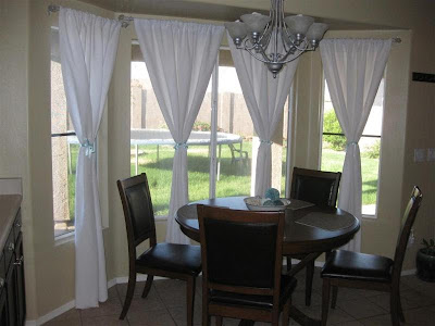
My suggestions included lighter bamboo shades in the windows that she could close for privacy and then do some kind of drapes as well, on either side of the windows, instead of hanging in front.
Before:
 I liked the white drapes, but I told Kortnei this is a spot she could really add some color and highlight this cool area of the kitchen. I suggested a panel on either side of the larger window, and then one on the outside of each window.
As usual, I suggested she consider finding a fabric she loved to add to the drapes or make her own. LOOK what she did!:


I. adore. those. drapes. Squeal!
Of course, I have to suggest some kind of woodwork SOMEWHERE. And that somewhere was her island/peninsula. It was such a feature between the family room and kitchen:

Kortnei took my advice on the beadboard and corbels and, well...swoon:
 I love it!!!
Speaking of that area, I suggested three new black counter height chairs with backs on them instead of the stools, if her budget allowed. Her stools got lost just a bit and the large island could handle something darker and larger:
 Because of her high ceilings, Kortnei was doing what we ALL want to do, which was decorating up. I have done it, I understand it. I don't have a problem with it, not one bit. But when you bring the accessories down, you bring the room down and make it a bit cozier.
 Before:


She already had a great start with accessories. I suggested some large items because of the space above the cabinets, in little vignettes in the corners so it didn't feel too cluttered.
After:


I loved her table but the chairs seemed a bit dark, so I suggested recovering her chairs with a new lighter fabric. I suggested a fabric that would work with her new drapes.
Before:

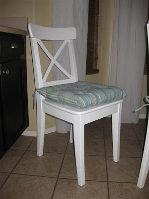
She went the extra mile and purchased new, beautiful white chairs with new cushions in colors that work with the walls and drapes:

Didn't she do awesome? I am in LOVE with those chairs!
Here's the full view of her kitchen before:
 And the after:
It didn't happen overnight and it shouldn't...you should take your time to do it the way you want to, and find things that you love for your space.
So there you have it...an idea of what a consultation involves. All it takes is a little bit of work on your part, some trust in moi, and a week or two for me to get back to you. ;) If you are interested in a consultation, they are $30 per room. All you need to do is use the Paypal button on the left of my site and then e-mail your pictures, thoughts and questions.
I'm so glad you love your kitchen Kortnei! If anyone else that has purchased a consult wants to share their room, please let me know!


